SLOGAN
We create a course for young people to fuel their passion.
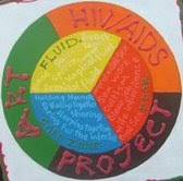
The logo is an embodiment of facts about HIV/AIDS prevention and basic Art education.
The logo comprises of seven colours, viz. blue, yellow, red, violet, green, orange, and white.
The colours at the centre of the circle are PRIMARY COLOURS, viz. blue, yellow and red.
The outer circle is made up of SECONDARY COLOURS. Secondary colour is mixture of two primary colours.
GREEN; blue + yellow
ORANGE; yellow + red
VIOLET; red + blue
At the background is white; white is a NEUTRAL COLOUR so as black.

The caption part of the logo educates about basic knowledge of HIV/AIDS prevention.
FLUID (yellow); encodes the carriers of the germ, HIV, which are blood, breast milk, saliva, sperm, seminal fluid, vaginal fluid, sweat.
DOOR (red); encodes the risky means, chances of contracting and routes of transmission of HIV which are through unprotected sex, sex work, oral sex, blow job, cultism, wife inheritance.
SAFE ZONE (blue); the following are regarded as safe zone as AIDS can not be contracted through ordinary social contacts with AIDS patient, such as holding hands, eating together, sharing plates, sleeping together, hugging, touching, or caring for the infected.


No comments:
Post a Comment